

Pound for pound, I will admit that there is not an office document application out there which is more fully featured than MS Word. However, it is unfortunate that Microsoft still charges consumers a lot of money for it when there are many aspects of it which can stand improvement in 2017. It is way too cluttered of an interface for beginners. And even for professional use, it is not optimally streamlined.
Of course, for the money, in the era of Google Docs, one could at least expect a new advanced feature such as an intelligent spell checker which keeps context in mind. But even if there’s the argument that adding new features costs too much time/money, streamlining the interface in general would help the program without requiring many new lines of code.
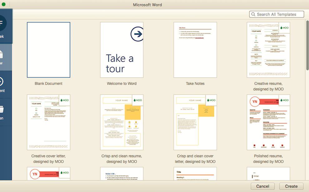

First of all, the initial menu. The blue column on the left side is well-done. It is simple, aesthetically pleasing and has relevant features. The search bar on the upper right is also helpful and space-efficient. But a easily 80% of the space of the space on this initial menu is wasted.
- The icons large, so only a few can fit on each row.
- Making them large is pointless since you still can’t see what the templates actually look like without creating the document. Why make icons if you can’t really see what are on them?
- Why aren’t the template icons streamlined? Why not just have 8 categories the user can click onto instead of having to scroll down to find what they’re looking for.
- Why are resumes on the top? Yes, Word is used for resumes, but people write/update them yearly (not every time they log onto Word). Wouldn’t it make more sense, if anything, to have templates like a business letter, brochure, APA format and MLA format at the top instead?


- Why is there a large icon on the left for copying and pasting? This command can already be done with the keyboard or mouse(and almost everyone knows how to by now. For pro users, this is redundant.
- Why is nearly half of the toolbar devoted to formatting templates? Why do they have large images when most of the other links don’t? Why should the user have to scroll through them each time they want to use a certain one? Streamlining those features with drop-down menus would’ve been a better idea. Like the initial menu when Word is opened up, it combines a bunch of unrelated templates in a linear order.
- I do want to mention that the top (blue) part of the toolbar gets a few things right. Simple icons are a space-efficient and aesthetically pleasing way to make a menu. It would be beneficial if there were more than four of them to fill the empty space.
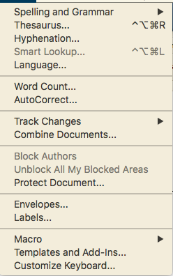
Printing: I can guarantee that more people use this feature than subscripts.


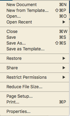
A number of these features are also cluttering the menus when they can be found on the front toolbar: Open, New, Save, Close, Share, Word Count, etc.
Overall, I made this post to exemplify why it is important to design graphical user-interfaces based around putting features people use the most in the forefront and more niche features in menus.